Creating a brand identity
We were approached by Tom & Will, the founders of a new backpack brand SALKAN to help bring their visual identity to life. With a massive love of travel, we clicked instantly and joined what would be the start of their adventure.

Tom & Will first met on a 6-month stint in the Alps and bonded over a footloose fixation on where they were hitting up next. A year passed, and predictably Tom got itchy feet – a trip across China, South East Asia and the US was on the cards. But he needed a new backpack, and couldn’t find any that fit the bill. Venting his frustration, Will echoed the same thoughts, so they went and did something about it. Here’s their story in their own words…
![]()
Thinking of an idea is one thing, but going through with a concept is another. We have taken on a mammoth task and it is a process that is (really) new for us, so we wanted to share with you all of our highs and lows over some blog posts.
When we decided to put everything into this, we knew that we had to represent our passion for travelling. Travelling has been a huge part of our lives since we both left Uni a few years back. We wanted to find a name and brand identity that gets across our passion and excites people into going travelling themselves.
Coming up with a name felt like a hard task. During the many brainstorming meetings, over countless coffees, we both agreed that when we travelled we felt that we are truly travelling and having the most fun when we had taken a wrong turn or gone a different route to the masses.
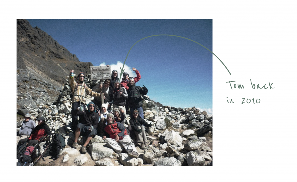
Tom’s trip to Machu Piccu in Peru took him on The Salkantay trek, a lesser-known route to one of the wonders of the world. Great memories and friends of whom he still speaks to today; 10 years after Tom completed the 4600m climb and 5-day adventure. Salkantay was a word we liked but was too long and after dropping the Tay, SALKAN felt like the name for us because of what it’s about…taking the alternative route. Some Peruvian friends of Tom’s also mentioned SALKAN has a translated meaning of ‘wild and adventurous’…it was meant to be.
A playful and human approach to our visual identity was important to us, so we wanted to find a graphic designer and illustrator who was as passionate about travelling as us. So they could understand our feelings towards travel. This is where we came across Claire. She also had the travel bug, having just been on a trip around Asia and her previous work suited the style we were after so well.
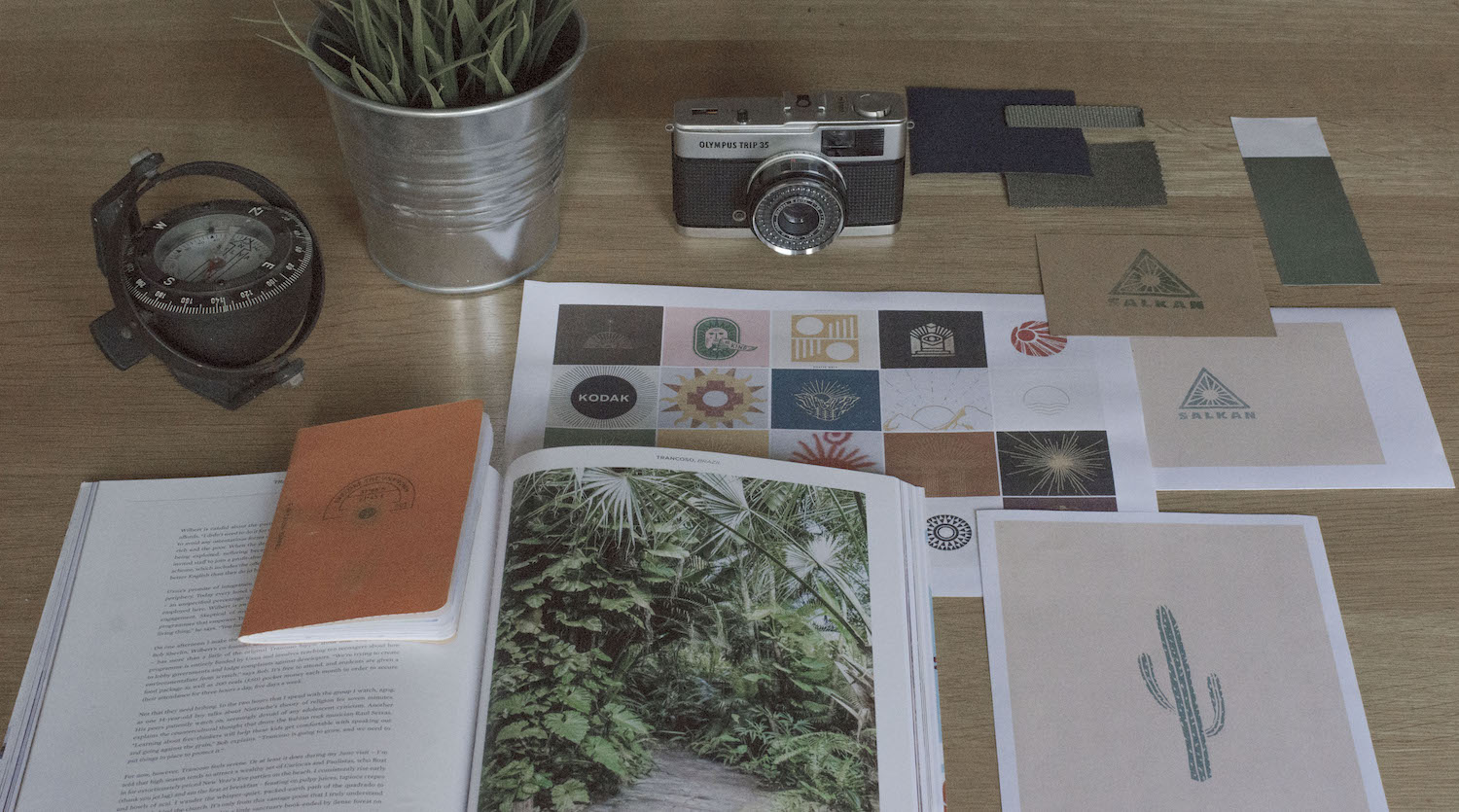
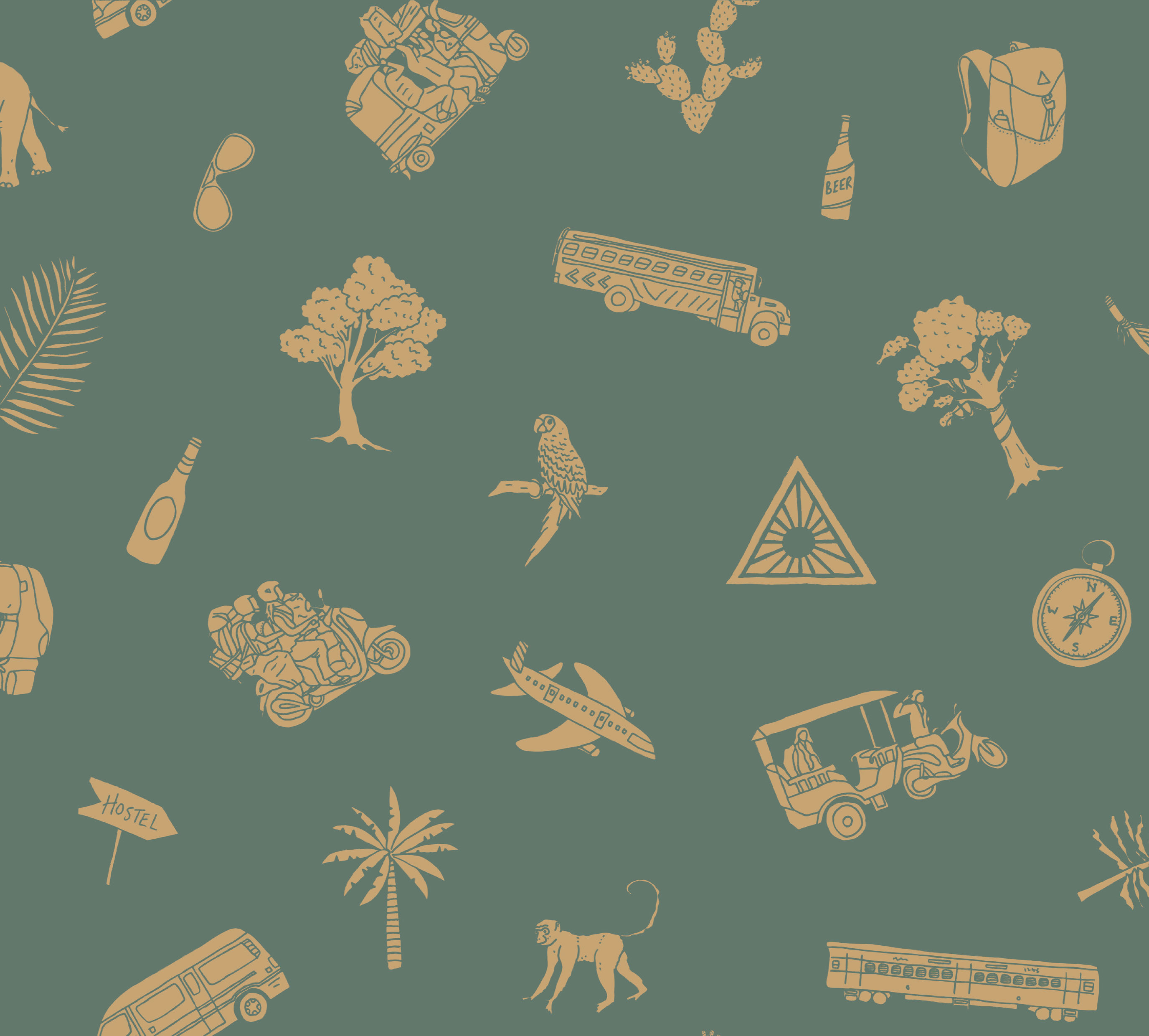
The collaborative approach we had with Claire meant that we were able to go deep into what travel and adventure meant to us. Through a range of directions that went from maps, topography, native patterns and the sun. The sun was right for us, as it not only has a connection to Inti – the Inca Sun God, which is heavily connected to Macchu Picchu where the Salkantay Trek leads – but also the relevance of the Sun wherever you travel. Let’s face it, we all want to follow the sun on our travels.

Exploration of styles followed the decision of using the Sun, this is where the triangle frame came from. Claire developed a wide variety of sketches that were then turned into logo concepts on screen that could be tweaked.
![]()
Having a playful feel was important to us to express the excitement of travel, rather than a minimal black-and-white feel. Claire was able to develop a range of hand-drawn illustrations that help capture the nostalgic highlights of travelling. Finally, making decisions on the colour palette, typeface, photographic direction and brand guidelines helped create consistency throughout the brand.
We are really proud of what we have created and we cannot recommend highly enough working with Claire. If you are looking for design work then go check out Claire’s work, you won’t be disappointed.”