Mennenia is a consultancy that specialises in helping people navigate technology with confidence and ease. They believe that technology, especially its lingo, has become unnecessarily complicated and they want to bring back the human element that seems lost in the digital space.
Mennenia
An iridescent identity for a digital coaching consultancy that fast-tracks women entrepreneurs into the world of technology.

Founded by Maxim Cramer, a successful female software engineer, she works on a personal level mediating between business and development, coaching both sides to communicate better. When creating the brand we wanted to visually represent the ease of the process with a simple yet beautiful identity.


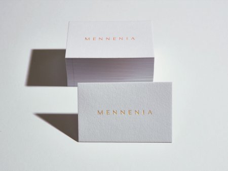
The logo is minimal, yet elegant with a core palette of calming greys. We introduce colour in a playful but sophisticated way in the form of holographic foils in print and digital gradients on screen. The iridescent details being a subtle link to the tech world.


We use simple line art as an abstract way to suggest navigation and wayfinding in what can appear such a complex maze in the digital space. Using only curved lines, it’s friendly and approachable – with the hand-lettering details adding a human touch.


Deliverables:
Brand identity, Print design
Location:
London, UK
As seen in:
Related projects
Adaptogenic Apothecary
Coming soon…

Classic Fresh Foods
Brand identity for a family-run fruit and vegetable supplier delivering fresh produce to central London’s most…

Trepadora
Brand identity and packaging for a female-founded curly hair brand helping women fall in love with…

Eco at Heart
A brand identity championing a new range of plastic-free and zero-waste lifestyle products.

Bloom & Bambi
Pregnancy and postpartum tea packaging for a mother and baby wellbeing brand.

Love My Human
A fun-loving identity for a luxury pet boutique and groomers on Kings Road, London.
