S. Thorogood & Sons is a family business that’s been growing and selling fresh produce since 1922. From turnips to tomatoes, beetroot to baby leaf, their wholesale markets offer an extensive range of produce grown with meticulous care and decades of expertise.
S. Thorogood & Sons
A brand identity for a family-owned, British wholesale fruit and veg business.

Selling across three historical market sites in London: New Covent Garden, New Spitalfields, and Western International, they needed a brand identity that celebrated the fact they’re one of the only wholesalers left who still keep their fingers green.


Typography has an essence of heritage with a classic serif typeface. Illustrations are reminiscent of traditional style linocuts.


Working with photographer Helena Murphy, we visited farms across Essex and Kent to capture to showcase the local produce and relationship S. Thorogood & Sons have with their suppliers.


Deliverables:
Brand identity, Print design, Photography
Partners:
Photography: Helena Rose Murphy
Location:
London, UK
As seen in:
Related projects
Mennenia
An iridescent identity for a digital coaching consultancy that fast-tracks women entrepreneurs into the world of…

Forest & Shore
Botanical illustrations and packaging design for an organic haircare brand based in Bali.

Womanhood
A brand identity for a lingerie retailer championing body confidence for real women.

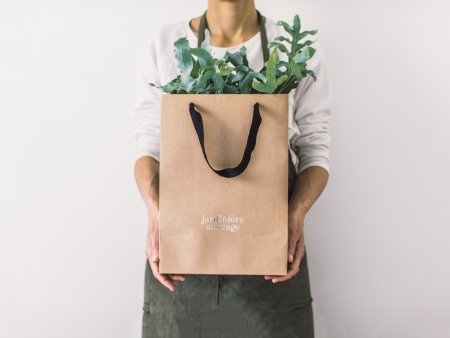
Jardiniére Sauvage
A botanical identity for an innovative city garden specialist in Paris.
Salkan
A hand-illustrated identity for a backpack brand born by two friends and the love of travel.

Trepadora
Brand identity and packaging for a female-founded curly hair brand helping women fall in love with…
